

Recalling (and encouraging) the thrill of the chase for Sale shoppers at Selfridges & Co.
Selfridges Sale

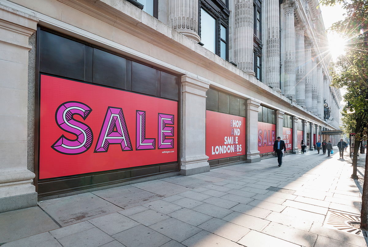
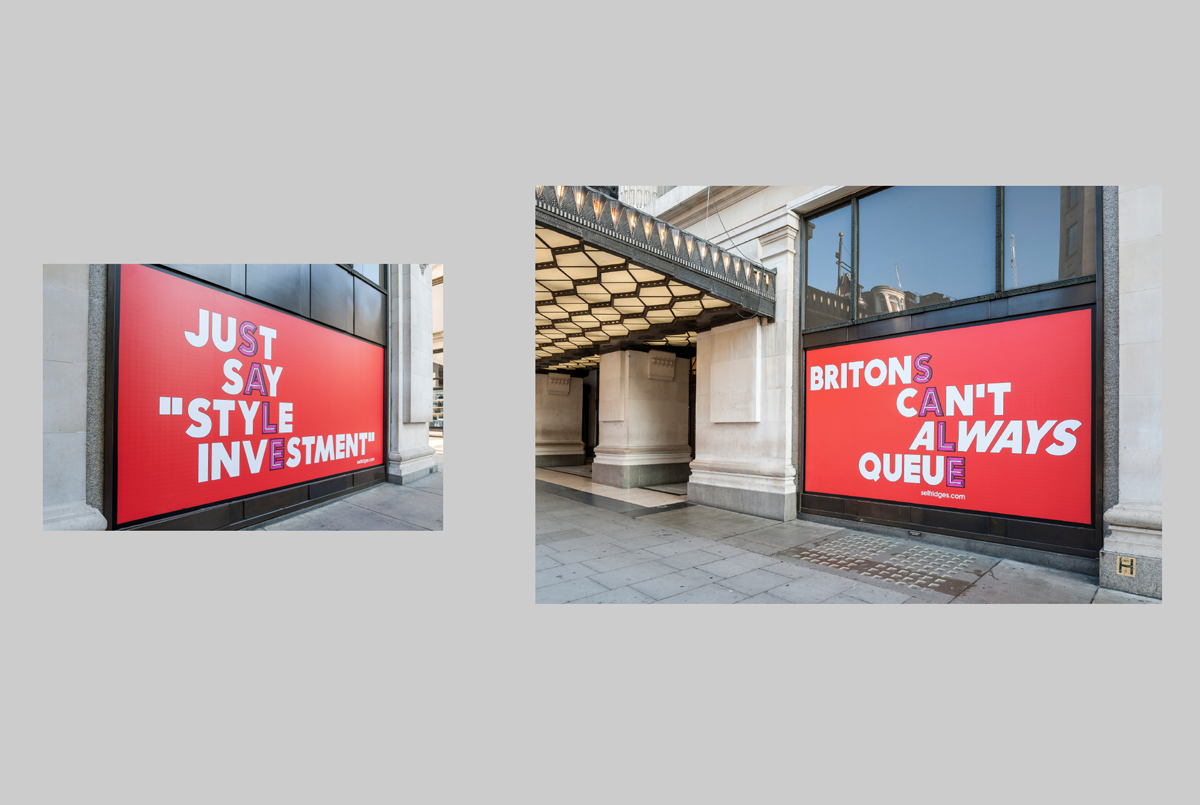

Recalling (and encouraging) the thrill of the chase for Sale shoppers at Selfridges & Co.